Skip to main content
Search
Search This Blog
Feral Doe
Pages
Home
Digital Art & Design
Creative Writing
More…
Posts
Latest Posts
December 11, 2016
Part 2 Stage 4 Flash Animation Project
December 04, 2016
Part 2, Stage 3 of Flash Project
November 27, 2016
Part 1, Stage 2 of Flash Project
November 20, 2016
Flash Animation Concept Sketches
November 13, 2016
Final Image for Creative Conscience Awards 2017
November 06, 2016
Preliminary Sketches for Creative Conscience Awards 2017
October 30, 2016
My Sample Portfolio Site
October 20, 2016
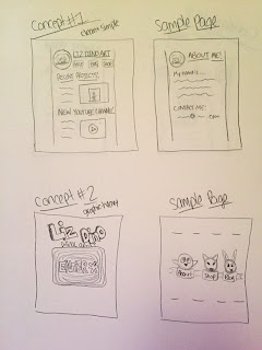
Concept Sketches for Portfolio Website
October 16, 2016
Empire X Presents "Bloodspore" and "Reign of Rot"!
October 08, 2016
Empire X, Bloodspore, Reign of Rot
October 04, 2016
October Update!
Older Posts